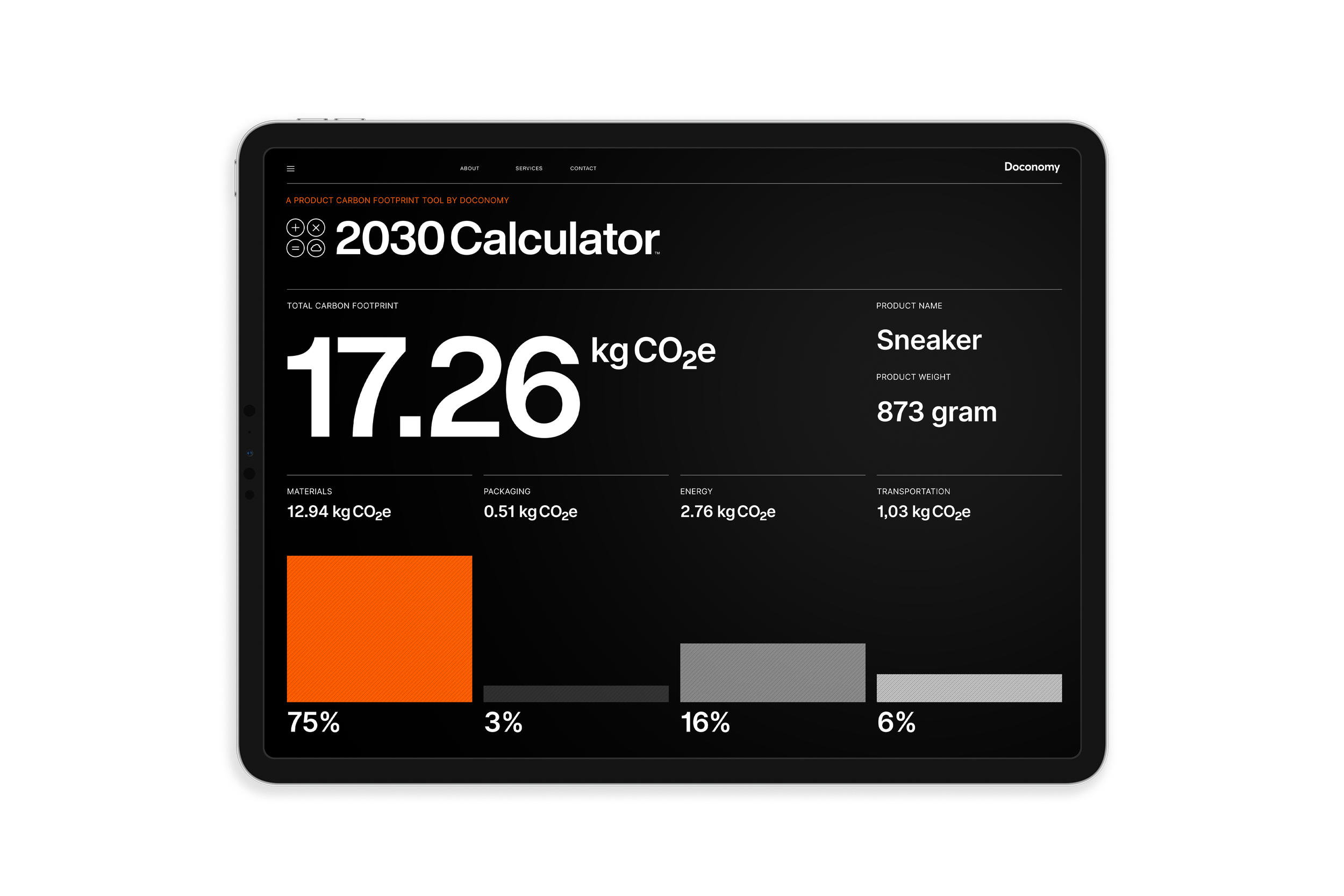
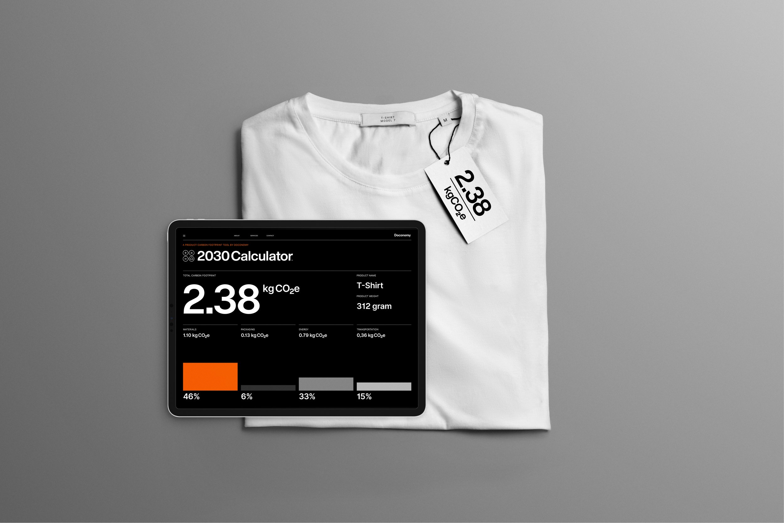
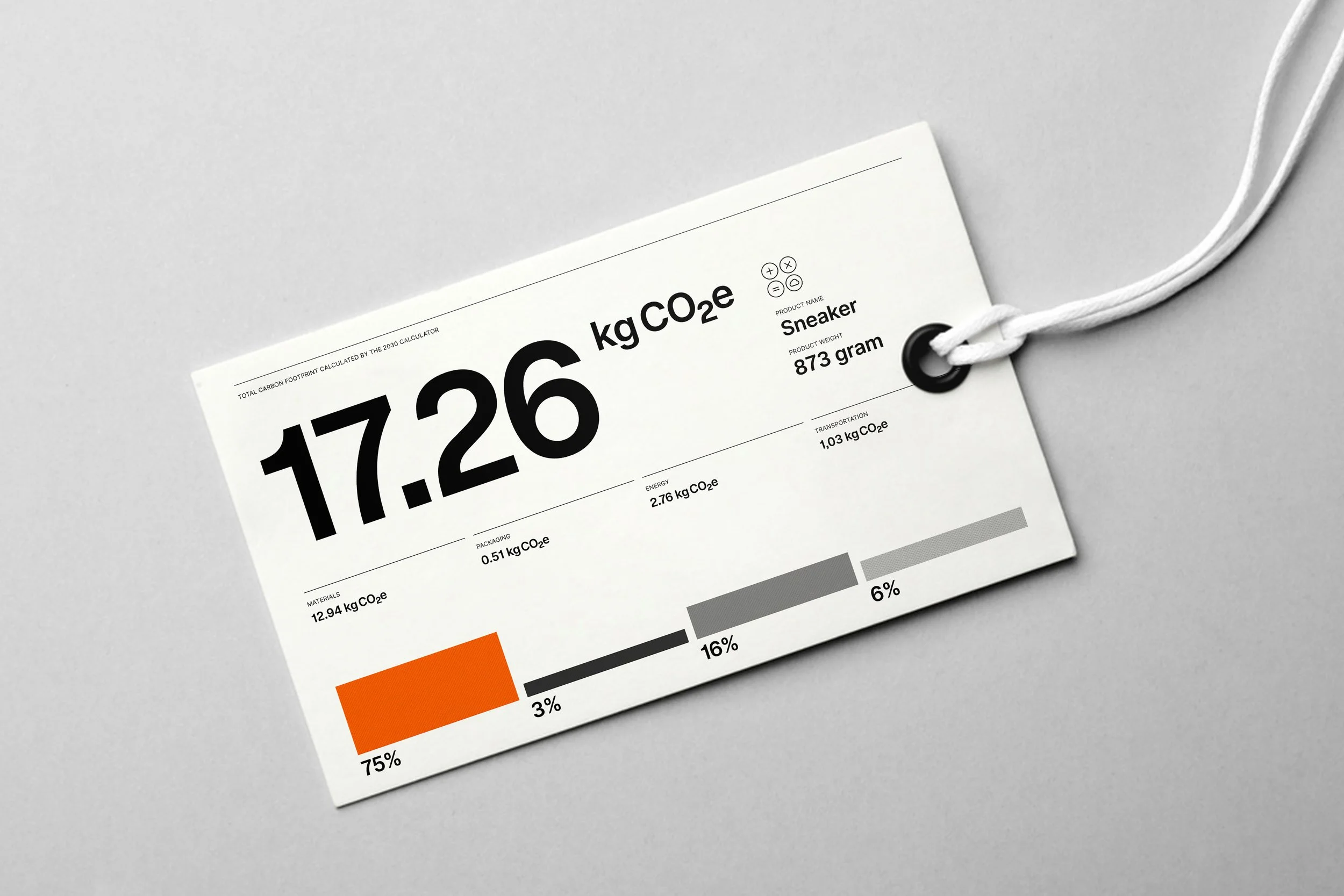
The 2030 Calculator by Doconomy
Doconomy is a Swedish impact-tech startup that aims to provide both consumers and brands with digital tools to help understand and reduce the climate impact of consumption. The challenge of product carbon footprint calculations is especially difficult for small and medium-size brands, which is a problem since many are willing to carbon label their products. The 2030 Calculator can generate results in minutes, empowering brands to be more transparent and motivating consumers to choose lower-impact products.
Introduction
We all create and use data every day, from knowing what our loved ones like for breakfast to telling them what time to expect us home. Our lives are packed full of data, some of which remains constant or predictable, from our date of birth and height to more changeable data like our bank balance or what movie we want to see next. Some data values are independent such as which soccer team we support, whereas our happiness value might depend on whether our team last won or lost and how long it was since we saw them play.
Therefore, data is not something exclusive to computers but is something they handle exceptionally well. Computers can help us sort data into different types such as numbers, characters or text strings and their values. We can then create and name variables such as name, gender, age, favourite breakfast cereal, movie or sports team to organise the data we wish to collect. A computer’s power is not just its capacity to remember small data facts about our personal lives; it also can collect ‘big data’ about millions of people. This power can be used to understand our collective preferences and opinions or serve up individual recommendations based on what it knows about us or people like us.
Some data is quantitative and helps answer who, when, and what types of questions, which can be collected through forms and simple surveys. Whereas other data is qualitative, helping answer why questions and is gathered by interviews or observation.
This data is valuable, particularly when it is personal data, and so we are witnessing it being traded like goods to create targeted messages and tailored digital services. We are also seeing data used as physical materials like paint or wood to create new digital objects, products and experiences through a field of expertise called ‘generative design’.
These developments feel like a far cry from when communication designers perhaps viewed data as editorial content that they were required to visualise in the form of charts or explain through the creation of information graphics. Data visualisation is a growing design specialism, particularly in a world that at times feels obsessed with measuring data. This obsession is not just the preserve of large organisations and governments since we also have access to a bountiful supply of personal data through the tracking ability of our mobile phones and fitness trackers. For some individuals who identify as ‘quantified selfers’ hope that their own tracking personal data will lead to self-improvement.
‘Improvement’ is a data value that is easily collected, sorted, analysed, and refined by computer algorithms. This artificial intelligence can be used to enhance and even automate design like creating simple websites. Design automation and predicting users’ desires through the employment of anticipatory design principles raises questions about the future role of designers in the design process.
This chapter will cover all of these topics through discussion and visual examples of leading practice. It looks at how designers use data to inform, drive and create design work and, just as significantly, how users like to interact with it.
Information design and data visualization
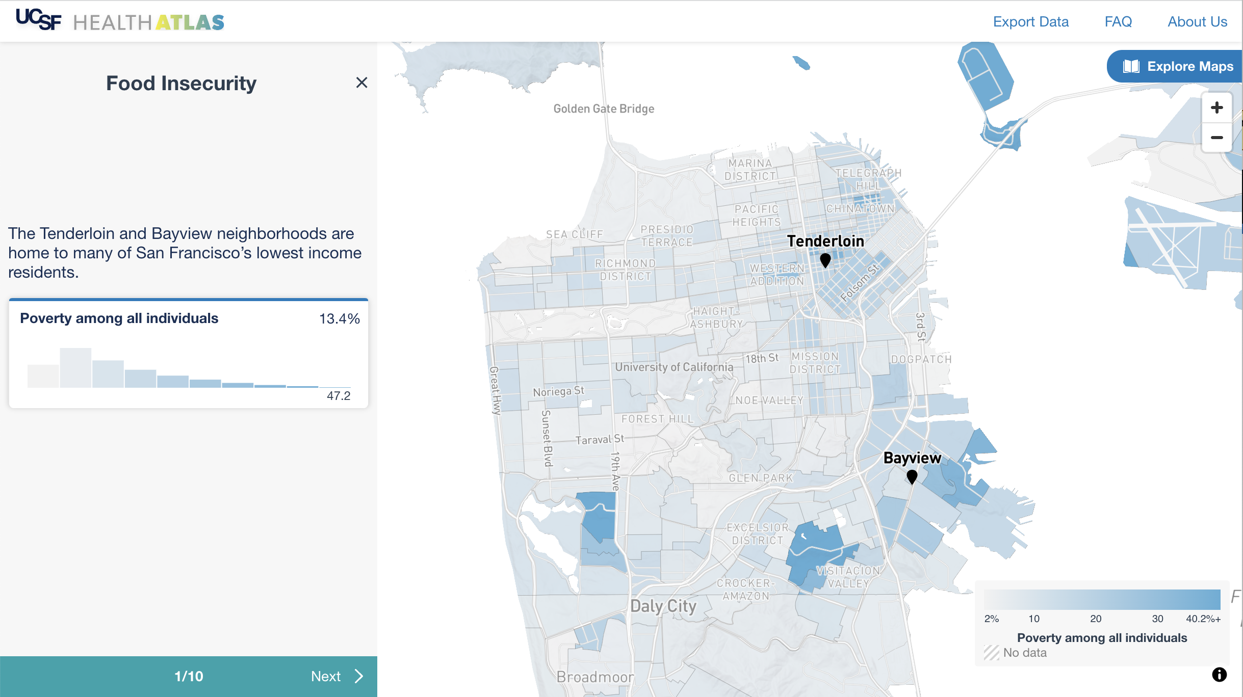
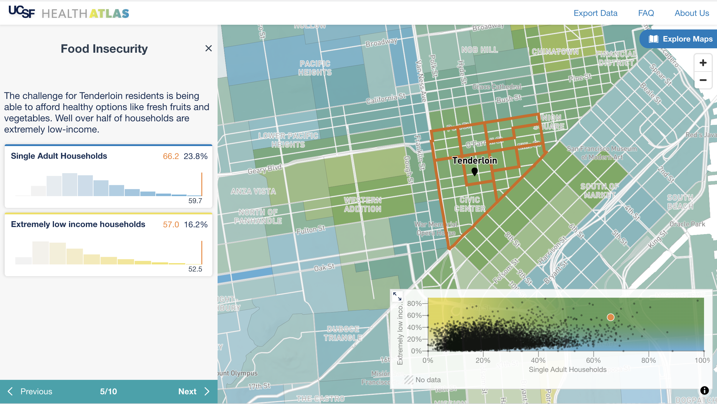
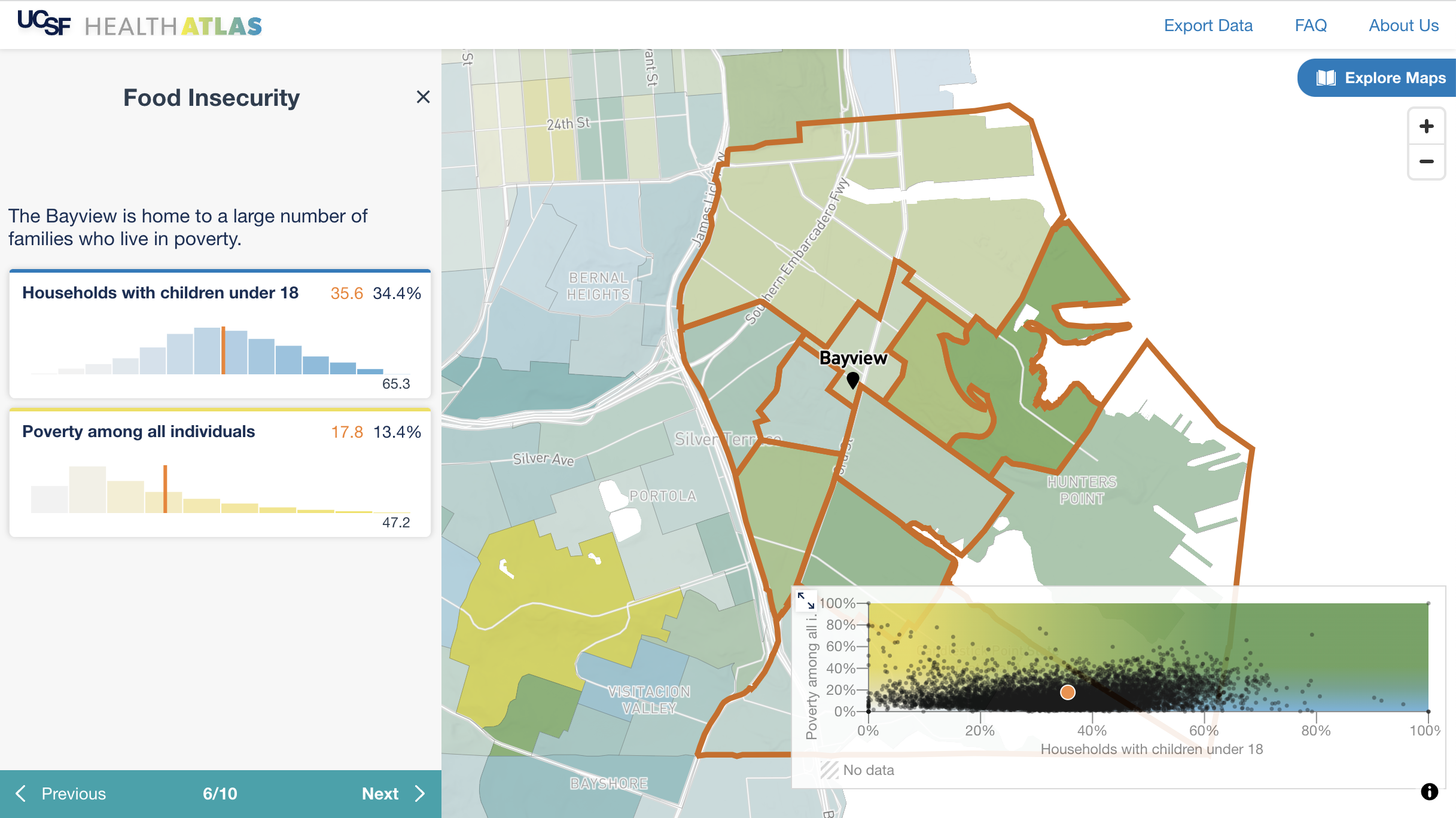
UCSF Health Atlas developed in partnership with Stamen Design
A team of health researchers led by Dr Debby Oh, University of California San Francisco (UCSF) Department of Epidemiology and Biostatistics, commissioned Stamen Design to build an online tool to help researchers explore how place influences health at various geographic levels across California. The goal of the project is to provide new insights into the geographic distribution of social determinants of health. The easy-to-use interactive atlas allows users to compare over a hundred characteristics using publicly available data.
Data Visualisation Key Stages
When creating any data visualisation, it is essential to keep in mind what we are trying to convey, the intended audience, why they should be interesting, and ideally, what we hope they will do or think as a result. A renowned data visualisation expert, Andy Kirk, advocates a four-stage process for planning data visualisation projects16. These stages are based on his suggestions:
Write the brief – plan and define the project scope
Gather and analyse data – collect, prepare and become familiar with the data
Define the editorial perspective – decide what to share with the intended audience
Design development – iterate designs based on data insights. Visual concepts, art direction and media choices will depend on the audience and context.
