Generative Typographic tool and outputs
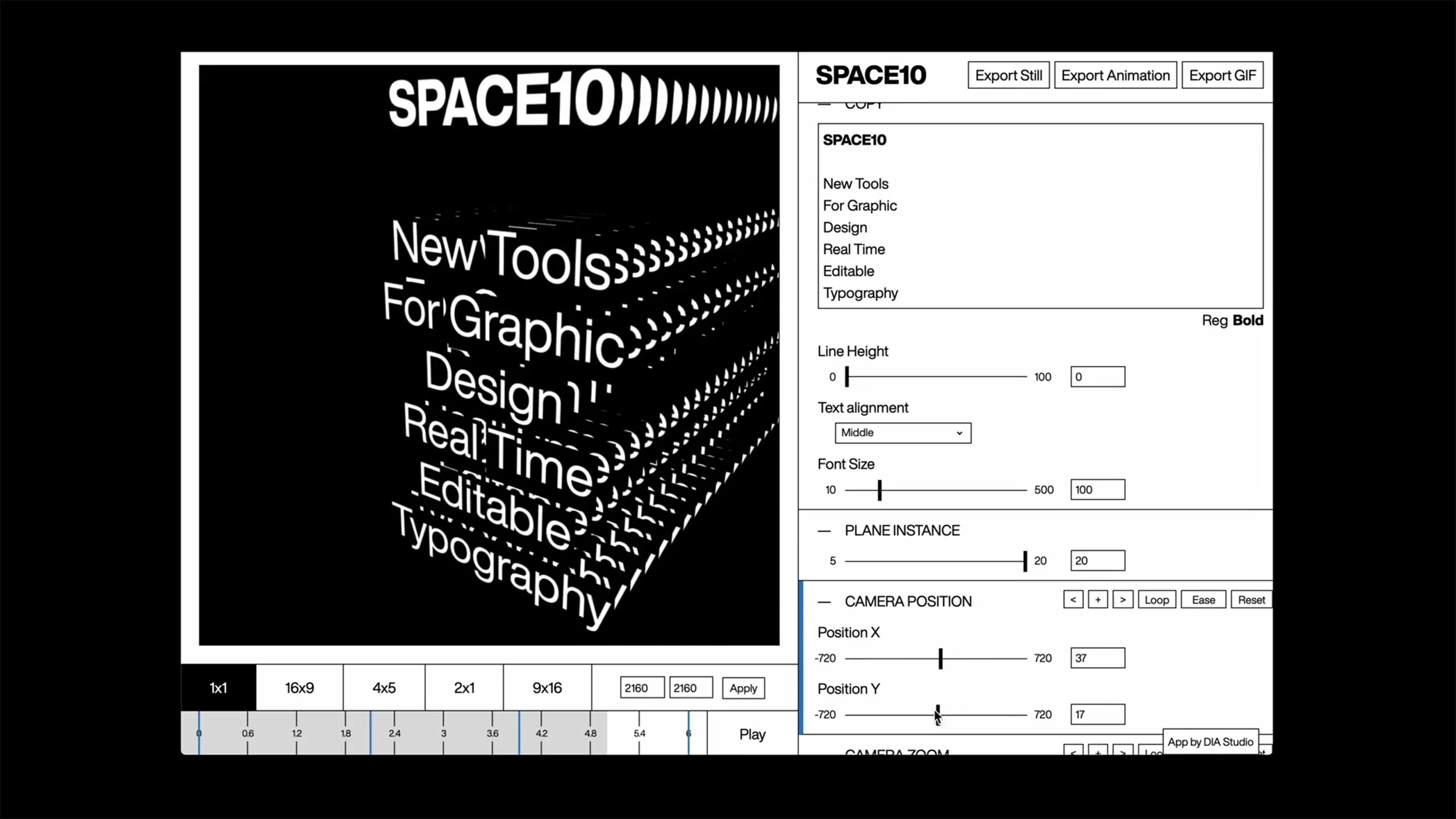
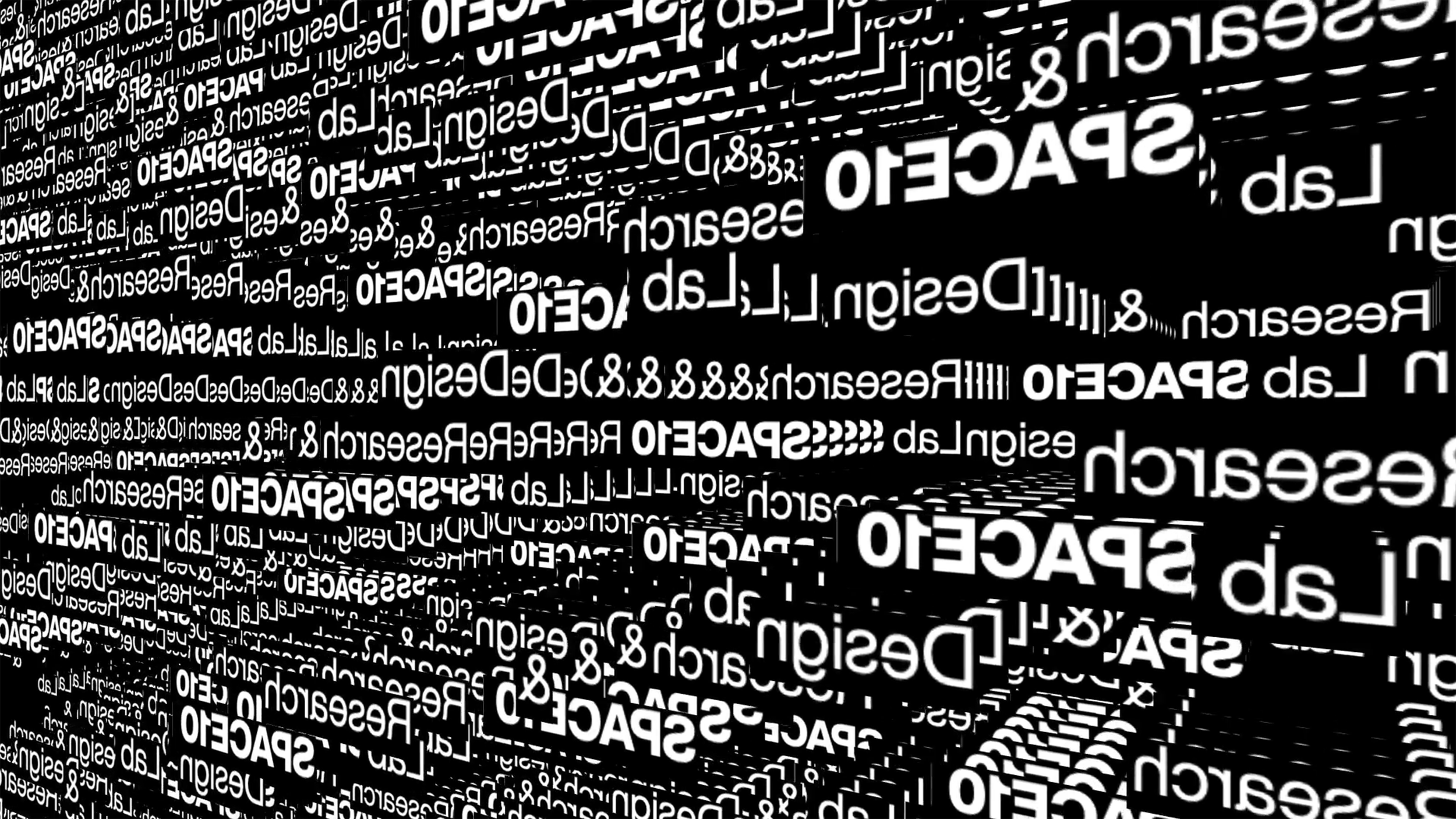
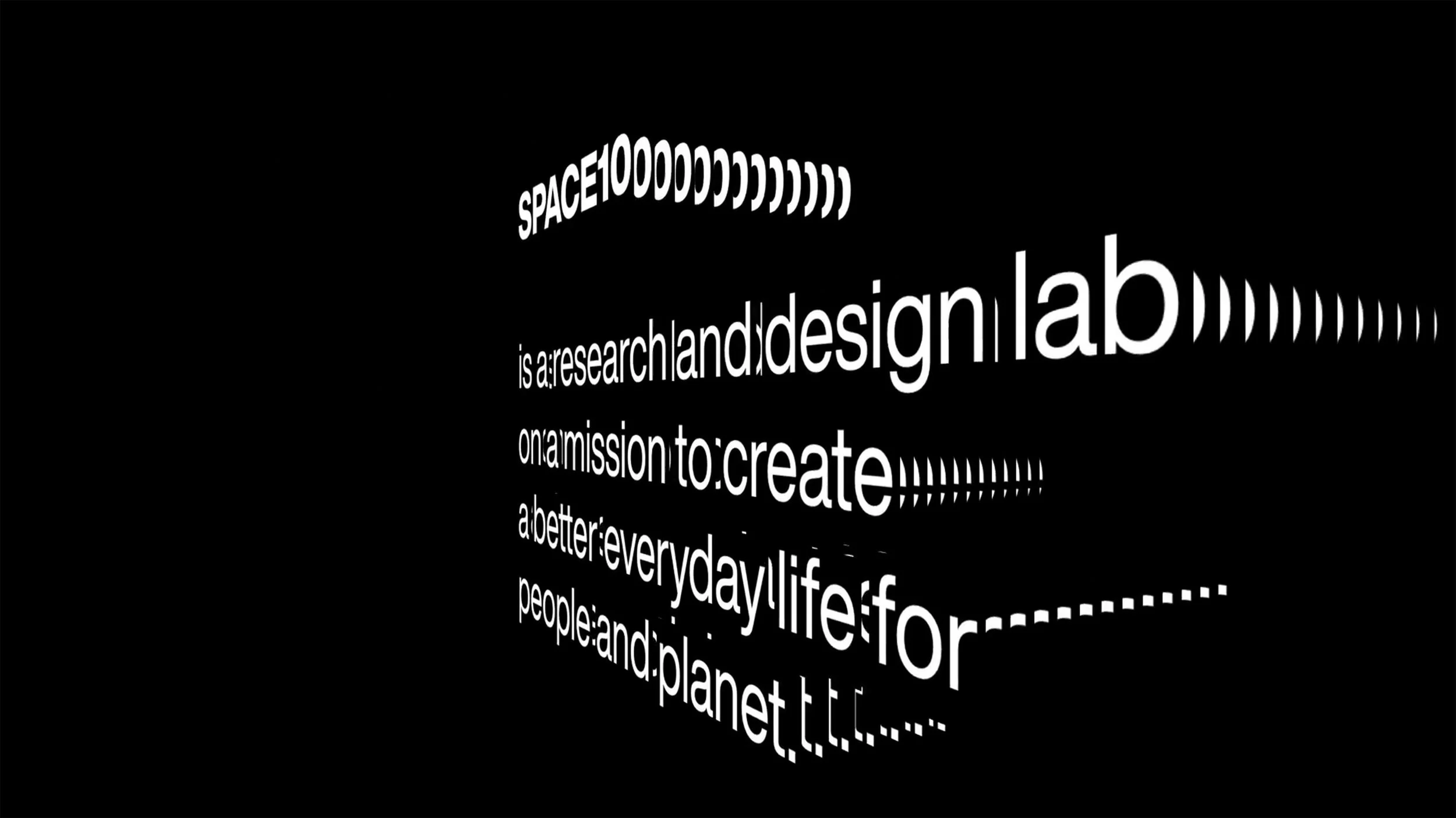
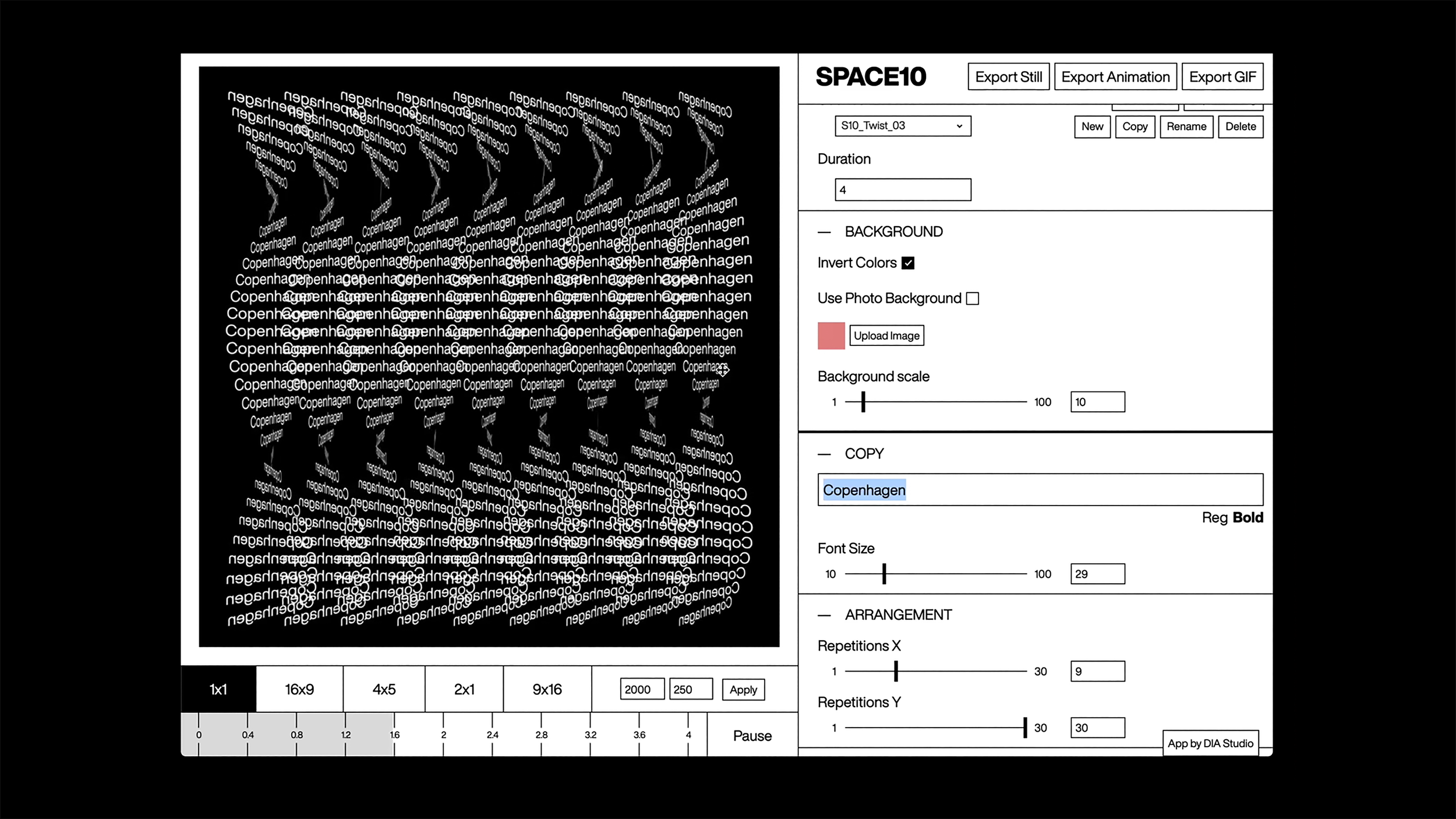
A moving typographic identity by DIA for client Space 10. DIA developed a proprietary generative tool that outputs 4K video, loop GIFs, PNGs and hi-res stills for a variety of applications.
Introduction
In the last 150 years, we have witnessed many remarkable innovations in the fields of communication and narrative storytelling – from Alexander Graham Bell’s telephone and David Edward Hughes’s wireless telegraphy to John Logie Baird’s television and beyond. However, none of them has replaced or endured as long as the Phoenicians’ 3,000-year-old idea to replace pictograms with a simple set of symbols to represent sounds – namely letters.
Letters form words that make up languages, which signify ideas, actions and thoughts. Letters have built the bedrock on which civilisations have communicated and shared their beliefs, history, knowledge, laws and literature with their peoples and their descendants for thousands of years.
Inseparably linked to the development of letterforms is the page or surface on which they exist. The visual arrangement of text and images, better known as layout, can be traced back to illuminated manuscripts in the Middle Ages. Johannes Gutenberg’s movable type technology and his printed 42-line Bible in the fifteenth century transformed the way we communicate through greater access to the published word. Similarly, Sir Tim Berners-Lee’s World Wide Web has more recently revolutionised our ability to access, share and communicate the digital word and its organisation.
With this long history of letters and their communication, it is unsurprising that a great deal of human endeavour has gone into developing letterforms and their layout. Typography, which is the art of arranging letterforms, is both the practical and visual expression of written language. Typography is not just a humble carrier of words to aid linguistic meaning. It can convey semantic meaning, too, because typography in size, shape, colour, placement and movement can express important messages of its own.
Whilst the craft of typography is an acquired skill, layout is an activity that designers and non-designers appear to do instinctively. Whether by intuition or luck, successful compositions have usually satisfied several aesthetic and hierarchical considerations. However, our twenty-first-century understanding of digital layouts and the grid systems that underpin them is a complex business. It relies on a sophisticated appreciation of compositional experimentation, psychology, rationalism, technical limitations, and interaction principles.
The following sections will help build an understanding of the fundamental characteristics of typography and composition models for grid layout. It will also explain accepted conventions and standards for typography and design layout across various digital media and interactive applications – from online publishing to digital television.
Fundamentals
To understand and appreciate the application of typography, it is essential to first become familiar with the basic characteristics and features of letterforms.Through their understanding, it is easier to diagnose issues with a particular typeface and communicate what characteristics are required when discussing typeface selection with fellow designers.
An anatomy of type
This diagram identifies common terminology used when describing letterforms.
Legibility and readability
Kern Type
Kern Type by Method of Action is an educational game for aspiring typographers to test their skills at kerning type. This beautifully simple tool is not only useful for teaching designers about kerning, it provides an excellent example of intuitive user experience design: type.method.ac


